A polished website can feel expensive and still leave a visitor wondering what the company does. Motion earns a few seconds of attention. Clear product communication decides whether those seconds become interest.
The best interface work makes a complex offer easier to understand. It does not ask the visitor to decode the design.
The first screen has four jobs
Before a visitor scrolls, the page should answer:
- What does this company provide?
- What problem does it solve?
- Who is it for?
- What happens when I take the next step?
If the hero cannot answer those questions, another animation will not rescue it. The visual system should reinforce the message—for example, showing scattered work becoming one connected workflow—not compete with it.
Motion needs a specific purpose
Useful motion can show sequence, causality, progress, or a change in state. It can help a visitor understand how inputs move through a system or how disconnected steps become one flow.
Motion becomes decoration when it repeats the same idea, delays access to content, or exists mainly to demonstrate production value. A good test is simple: if the animation disappears, does the explanation become less clear? If not, the page may be stronger without it.
Premium does not mean dense
High-end interfaces often feel calm because each section carries one idea. Strong typography, intentional spacing, a controlled palette, and a small number of distinctive details create more confidence than a screen full of competing effects.
This is especially important for a service that already requires explanation. The visual design should reduce the effort needed to understand the offer.
Performance is part of the impression
A cinematic asset that arrives late or stutters on mobile signals the opposite of technical confidence. Every visual should have a performance budget, a responsive composition, and a reduced-motion alternative.
Practical checks include:
- useful content appears before large media finishes loading;
- the main action remains stable while assets load;
- mobile layouts do not crop the explanation;
- animation avoids blocking scroll or input;
- reduced-motion users receive an equally complete experience; and
- the page remains clear when viewed on a slower connection.
Every action should say what it does
Generic buttons such as “Explore,” “Continue,” or “Get started” force the visitor to guess. A stronger action names the value or destination: “Find what to fix first,” “See how the system works,” or “Start my business review.”
The primary and secondary actions should also be meaningfully different. One begins the product experience. The other teaches, shows an example, or explains delivery.
Conversion is a comprehension test
The page succeeds when the right visitor can explain the offer in one sentence, recognize their own problem, and predict the next step. That is the standard the visual system serves.
Beautiful design creates desire. Clear product language turns that desire into a confident action.
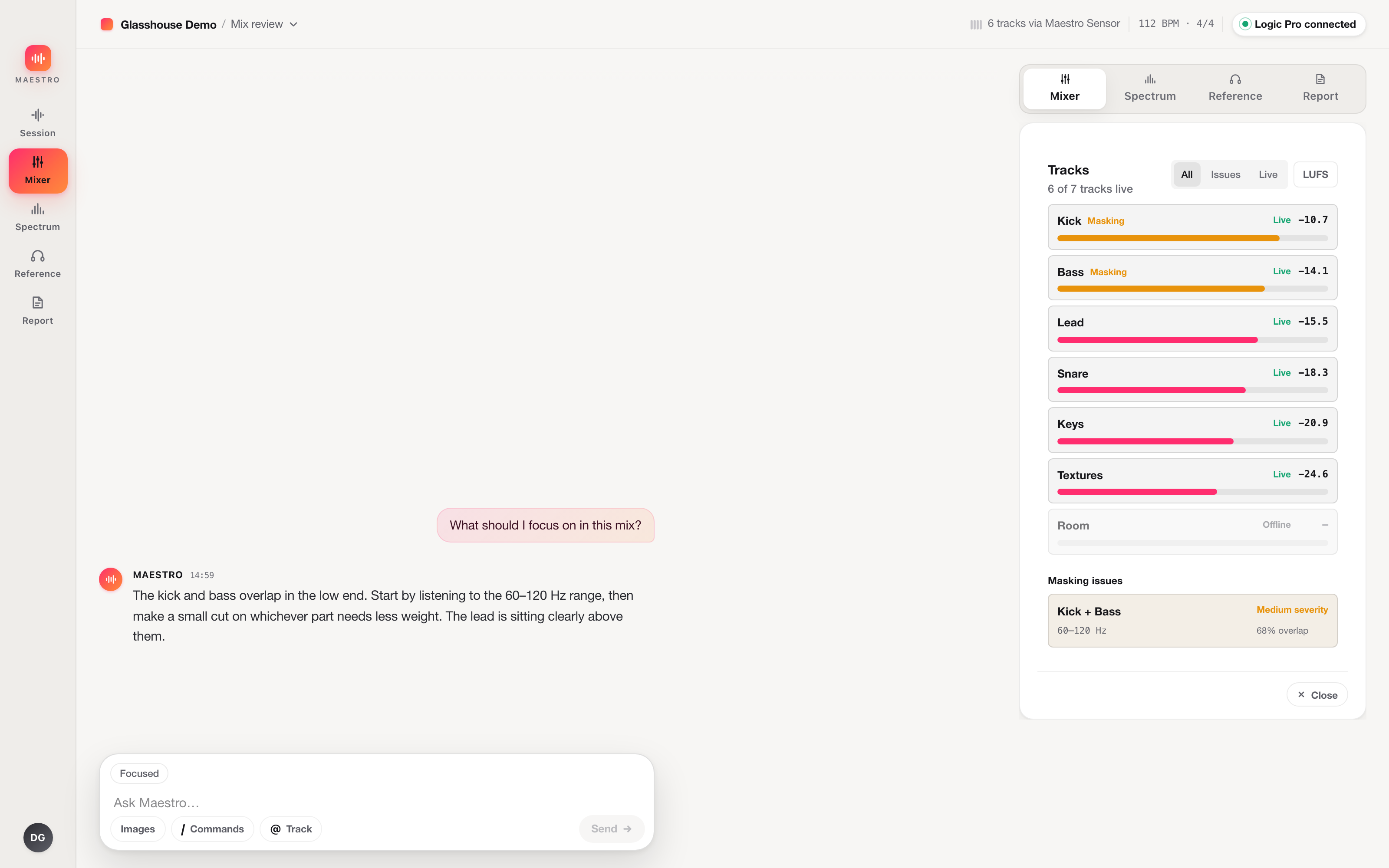
 Maestro development preview · synthetic session data